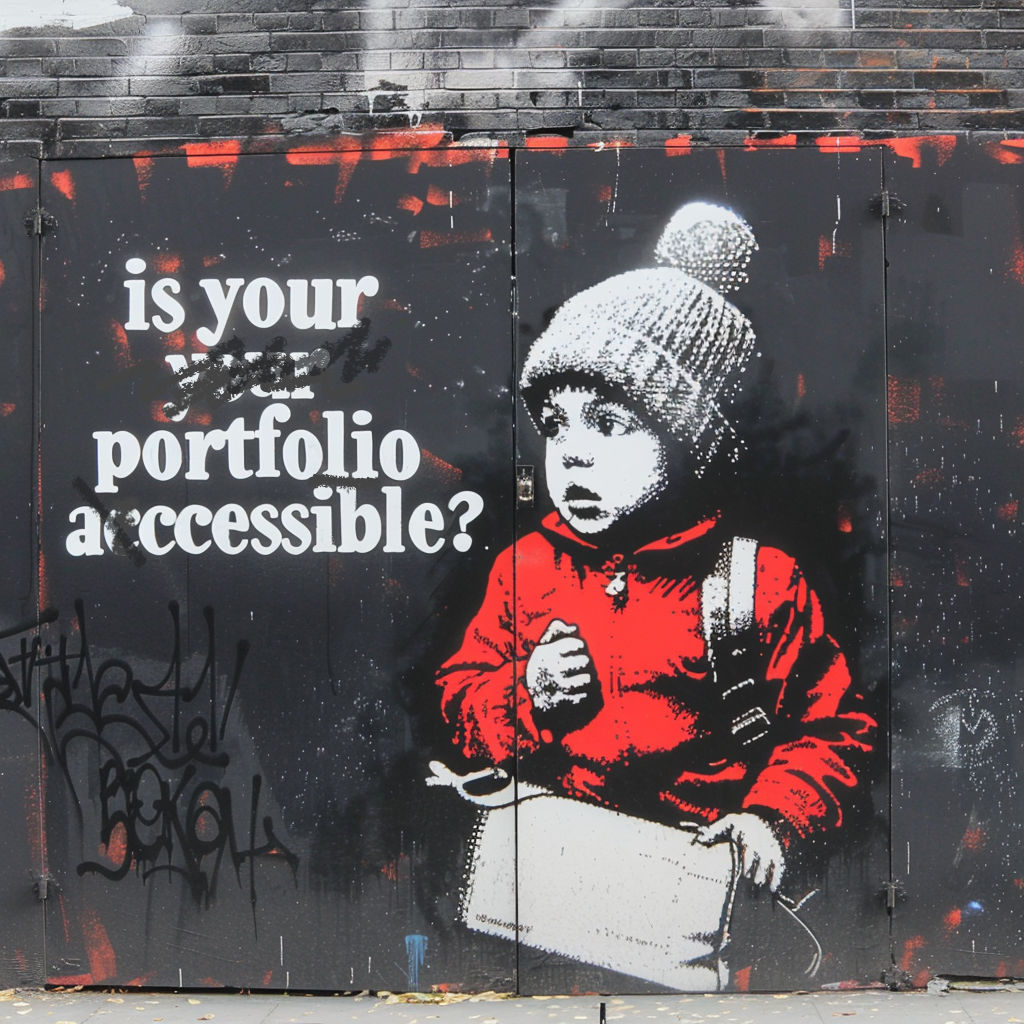
As designers, our job is to create experiences that everyone can enjoy. But do we think about accessibility when it comes to our own resumes and portfolios?
Why it matters?
Making your design portfolio accessible is important and here’s why:
🏅 1. Priorities and Values
Demonstrating a commitment to accessibility in your own materials speaks volumes about your professional values. It shows potential employers and clients that you prioritize inclusivity and are aware of the importance of designing for all users.
🌟 2. Extended UX Skills
An accessible portfolio is not just beneficial for people with disabilities; it enhances the experience for everyone. Clear navigation, readable fonts, and sufficient color contrast make your work more enjoyable and easier to navigate for all users… and it’s a great way to show-off your extended skills.
🔍 3. SEO Benefits
Accessible websites often perform better in search engine rankings. Using semantic HTML, proper headings hierarchy, alt text for images, and a logical content structure can improve your visibility online, making it easier for potential employers and clients to find you.
📈 4. Increased Engagement
An accessible portfolio can lead to higher engagement rates. Recruiters and hiring managers who find your work easy to navigate and understand are more likely to spend time exploring your portfolio and reaching out to you.
Here are some design and development tips
Use Clear HTML
Clear HTML helps screen readers understand your content. Use tags like <header>, <main>, <article>, and <footer> to create a logical order. This not only improves accessibility but also helps with SEO.
Example:
1
2
3
4
5
6
7
8
9
10
11
12
13
14
15
16
17
18
19
20
21
22
23
<header>
  <h1>Marcelo Paiva</h1>
  <nav>
    <ul>
      <li><a href="#about">About</a></li>
      <li><a href="#portfolio">Portfolio</a></li>
      <li><a href="#contact">Contact</a></li>
    </ul>
  </nav>
</header>
<main>
  <section id="about">
    <h2>About Me</h2>
    <p>I’m a UX designer, developer and passionate about accessibility...</p>
  </section>
  <section id="portfolio">
    <h2>My Work</h2>
    <!-- Portfolio items -->
  </section>
</main>
<footer>
  <p>© 2024 Marcelo Paiva</p>
</footer>
Ensure Good Color Contrast
Text should have enough contrast against its background to be readable for people with visual impairments. Use tools like the WCAG Contrast Checker to verify that your color choices meet the WCAG AA or AAA standards.
Example:
- Use a contrast ratio of at least 4.5:1 for normal text and 3:1 for large text.
Provide Alt Text for Images
Alt text descriptions are crucial for screen readers to convey the content of images to users who cannot see them. Be descriptive yet concise.
Example:
1
<img src="portrait.jpg" alt="Portrait of Marcelo Paiva, a UX designer passionate about accessibility">
Use Easy-to-Read Fonts and Sizes
Choose fonts that are easy to read and avoid using overly small font sizes. Ensure that your text can be resized without losing content or functionality.
Tips:
- Use a base font size of at least 16px.
- Avoid using decorative fonts for large blocks of text.
Make Your Navigation Keyboard-Friendly
Ensure that all interactive elements (e.g., links, buttons) can be accessed and operated using a keyboard. This is crucial for users who cannot use a mouse.
Tips:
- Use the
:focuspseudo-class to highlight focused elements. - Ensure that all form fields and buttons can be tabbed through in a logical order.
Create Accessible Forms
Label your form fields properly, provide clear instructions, and ensure that forms can be navigated using a keyboard. Use ARIA labels where necessary.
Example:
1
2
3
4
5
6
7
8
9
<form>
  <label for="name">Name:</label>
  <input type="text" id="name" name="name">

  <label for="email">Email:</label>
  <input type="email" id="email" name="email">

  <button type="submit">Submit</button>
</form>
Test with Screen Readers
Regularly test your portfolio with free screen readers like NVDA (Windows) or VoiceOver (Mac). This will help you identify and fix accessibility issues that may not be apparent otherwise.
Tip:
- Use a screen reader to navigate your site and ensure that all content is accessible and understandable.
- Download Deque’s Screen Readers Survival Guide - Basic Keyboard Shortcuts
Use ARIA Landmarks
ARIA landmarks help screen reader users understand the structure of your page. Use roles like banner, navigation, main, and contentinfo to define different sections.
Example:
1
2
3
4
5
6
7
8
9
10
11
12
<div role="banner">
  <!-- Site header -->
</div>
<div role="navigation">
  <!-- Site navigation -->
</div>
<div role="main">
  <!-- Main content -->
</div>
<div role="contentinfo">
  <!-- Footer information -->
</div>
Offer Multiple Ways to Contact You
Provide various contact methods (e.g., email, phone, social media) to accommodate different user preferences and needs.
Example:
- Include a contact form, email address, and social media links on your contact page.
Choose Accessible Templates
When using platforms like Squarespace, be mindful of the templates you select. Not all templates are created with accessibility in mind. Look for templates that prioritize accessibility features, such as proper heading structures, high contrast, and keyboard navigability. Avoid templates that rely heavily on images without alt text or have poor contrast.
Tip:
- Check the accessibility of a template before committing to it, and make necessary adjustments to enhance accessibility.
Test with the WAVE Tool
Use the WAVE tool to check your website for accessibility issues. This free tool provides visual feedback about the accessibility of your content, helping you identify and fix potential problems.
Tip:
- Regularly test your portfolio with the WAVE tool to catch and address any new accessibility issues.
Conclusion
Making your design portfolio accessible is a vital step in ensuring that your work can be appreciated by a diverse audience. By following these practical tips, you can demonstrate your commitment to inclusive design and set yourself apart as a thoughtful, professional designer.
💙 I’m here to help
If you still need assistance on this topic, I volunteer a couple of hours a week to help UX professionals seeking guidance with the end-to-end design process, digital accessibility, pointers on how to get in the industry, portfolio reviews, resume advice, etc.
Schedule a 1:1 session (FREE) and lets review your portfolio
Making our work accessible to everyone because it’s the right thing to do.
Hell yeah!
