
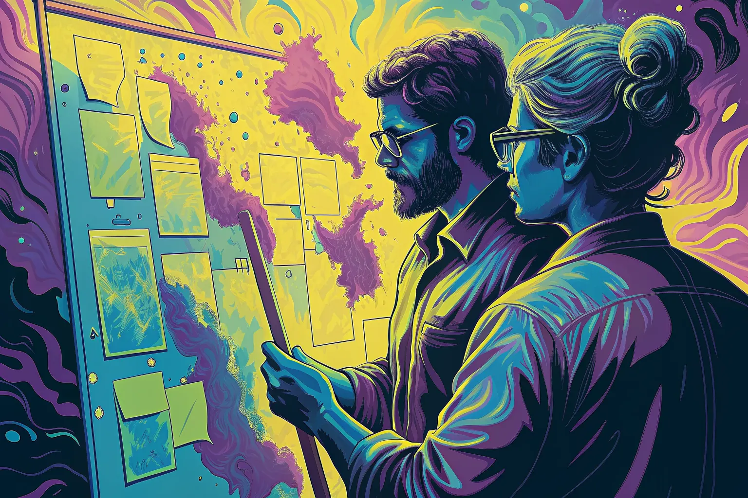
Draws this one again — same subject and the same people, a new palette and a new angle on it, described afresh. It replaces the drawing on this page for everyone, until somebody draws another. Costs the site about eight cents, and a few seconds.
Or press ←the left arrow and →the right arrow.
Communicating Accessibility Through Inclusive Design
Writing — read the piece
- Meant to show
- A blind colleague leading the session, the team rearranging the plan around what he says rather than consulting him after it is drawn.
- Asked for
- A man reading notes on a braille display at a whiteboard while colleagues rearrange sticky notes to match what he says
- Drawn with (triad)
#a54da1#cec743#3ea6b0
Why these three
Three points spaced evenly around the wheel — the furthest apart three hues can be.
- SeedSHA-256 of
communicating-accessibility-through-inclusive-design, which is the same every time and different for every piece. - Base hueThe first two bytes as a fraction of 65,535, times 360 = 303°.
- GeometryThe third byte modulo 4 picks triad, which adds 0°, 120°, 240°.
- WobbleThree more bytes shift each by up to ±12° — +0.0°, −6.0°, +2.5° — so two pieces that draw the same geometry are still not the same shape on the wheel.
- Result
#a54da1303° at 54% saturation, 65% value#cec74357° at 67% saturation, 81% value#3ea6b0185° at 65% saturation, 69% value
Saturation never drops below 72% and value never below 78%, which is what keeps a hue reading as the color it was chosen to be rather than as a dark. More on how these are made.