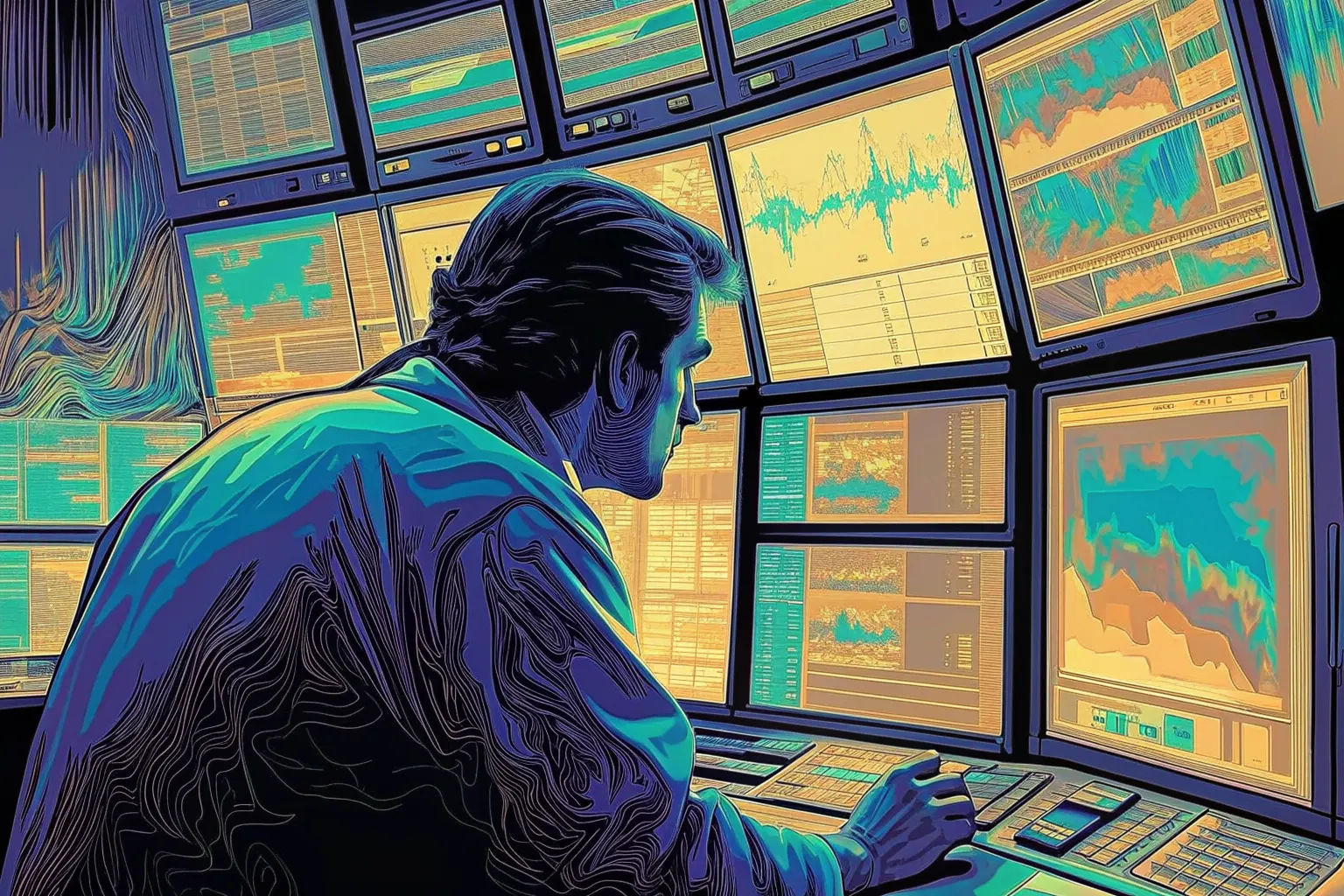
Draws this one again — same subject and the same people, a new palette and a new angle on it, described afresh. It replaces the drawing on this page for everyone, until somebody draws another. Costs the site about eight cents, and a few seconds.
Or press ←the left arrow and →the right arrow.
How do you keep something powerful approachable?
Writing — read the piece
- Asked for
- A trading desk with six crowded monitors, a person leaning in close to read one small panel
- Drawn with (split)
#b4905c#48b7ac#505daf
Why these three
The opposition backed off by 30 degrees either side, which keeps the contrast without the vibration.
- SeedSHA-256 of
how-do-you-keep-something-powerful-approachable, which is the same every time and different for every piece. - Base hueThe first two bytes as a fraction of 65,535, times 360 = 32°.
- GeometryThe third byte modulo 4 picks split, which adds 0°, 150°, 210°.
- WobbleThree more bytes shift each by up to ±12° — +3.2°, −8.0°, −10.2° — so two pieces that draw the same geometry are still not the same shape on the wheel.
- Result
#b4905c35° at 49% saturation, 71% value#48b7ac174° at 60% saturation, 72% value#505daf232° at 54% saturation, 69% value
Saturation never drops below 72% and value never below 78%, which is what keeps a hue reading as the colour it was chosen to be rather than as a dark. More on how these are made.