paiva Get In Touch

Get In Touch

Prefer using email? Say hi at [email protected]

No Latin

Improving the UX for people with disabilities by eliminating the use of Lorem Ipsum in the design industry.

About this project

As UX professionals, we should be committed to designing solutions as ambassadors for all users, including people with disabilities.

“No Latin” (nolatin.com) is a free web-based React app that converts blocks of content into an accessible web prototype using Accessibility best-practices.

This tool invites all designers and researchers to bringing intent into their design process by elevating the content quality early for people with disabilities.

Industry Challenge:

Most UX professionals struggle to incorporate accessibility considerations into their design process, resulting in poor experiences for users with disabilities.
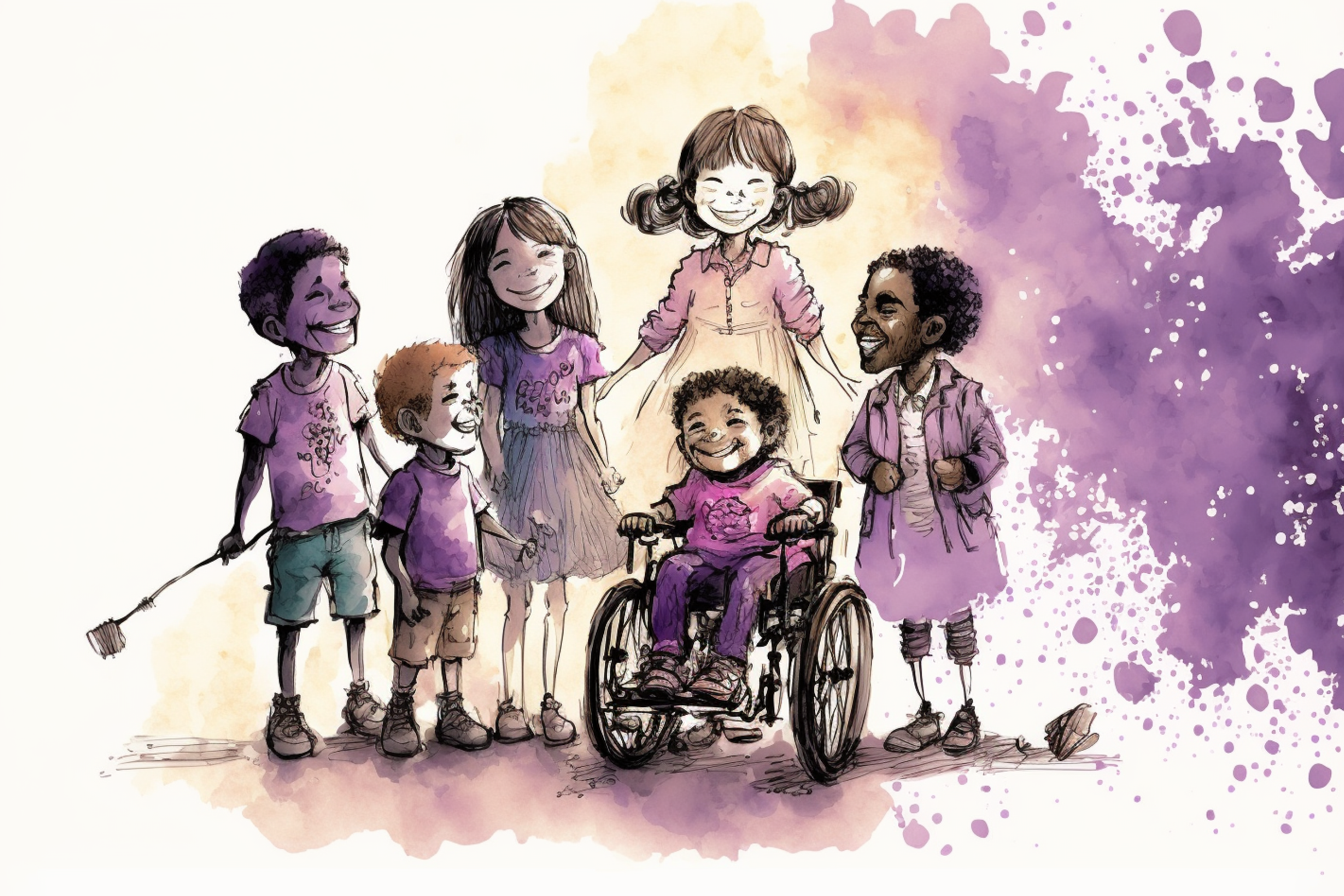
An illustration of a multicultural group of children, including a boy in a wheelchair, smiling for a photo celebrating those who design with Accessibility in mind.

Poor content leads to poor Accessibility

Content and Accessibility are considered an afterthought. If designers continue to use Loren Ipsum content placeholders in early design concepts, people with disabilities that rely on assistive technologies (i.e.: screen readers) will continue to be excluded from early user research studies.

Solution

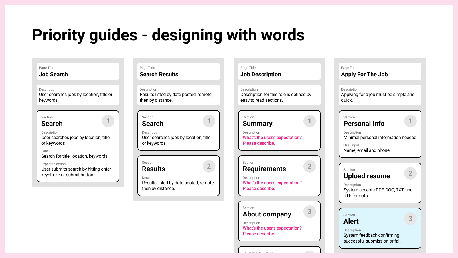
Create good content from the beginning using Priority Guides with headlines and elements blocks, sorted by user needs.

Putting intent on writing with priority guides

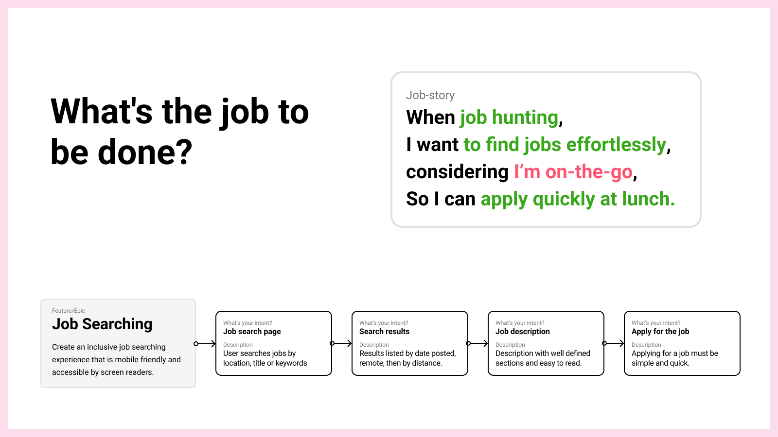
A good way to start focusing on content designing before the interface designing stage is using a content-first method called priority guides.

Simply put, a priority guide contains content and elements for a mobile screen, sorted by hierarchy from top to bottom and without layout specifications.

This approach enables UX professionals to focus on the user’s priorities and needs, before jumping on interface designing.

Creating Priority Guides

I created a Figma Template to help designers craft their content faster.
Figma template for creating priority guides by Marcelo Paiva
The template suggests designers to work their way through the problem definition, by creating a story and journey mapping as preparation for building the priority guides.
Priority guides are simple and easy to build, it's like designing with words, but focusing on the user's expected inputs and outcomes.

From Intent Framing to Prototyping

By now, all the content needed is in place to begin building the intent framing (a collection of guides), which will be converted into a fully interactive and accessible HTML prototype.

The following is a step-by-step example on how we create and preview the accessible prototype for a Job Search page.

1) Create a page

Adding a page to host priority guides. Let’s create a Job Search page:
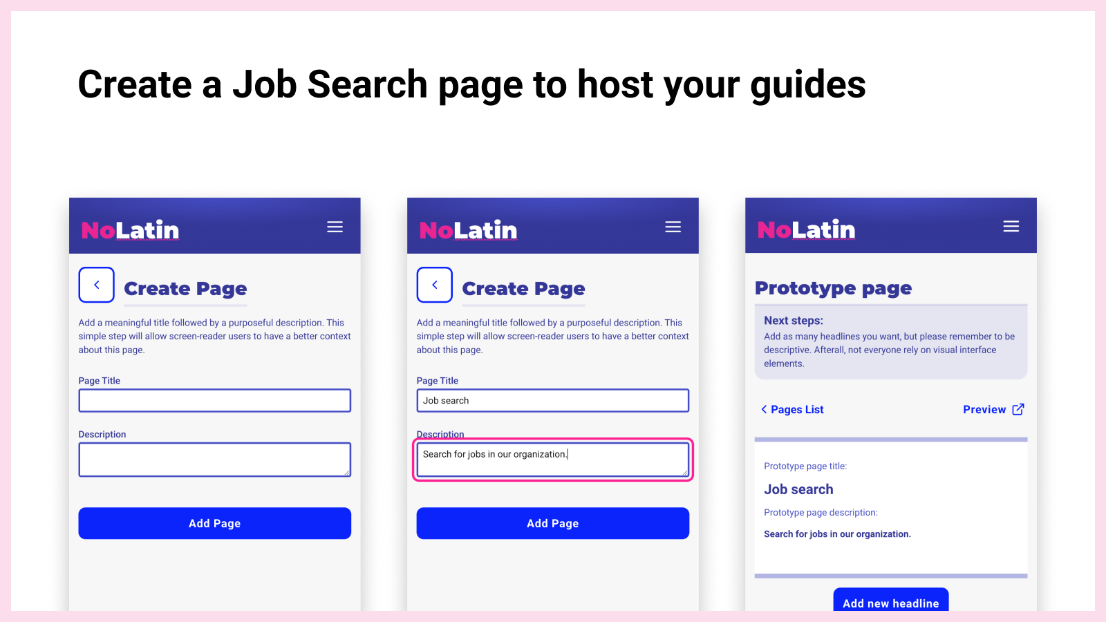
Step-by-step example on how to create a page in nolatin.com showcasing the importance of always adding a title and description to a page.

2) Add a section

Create a section that will serve as a page landmark and contain the user input elements:
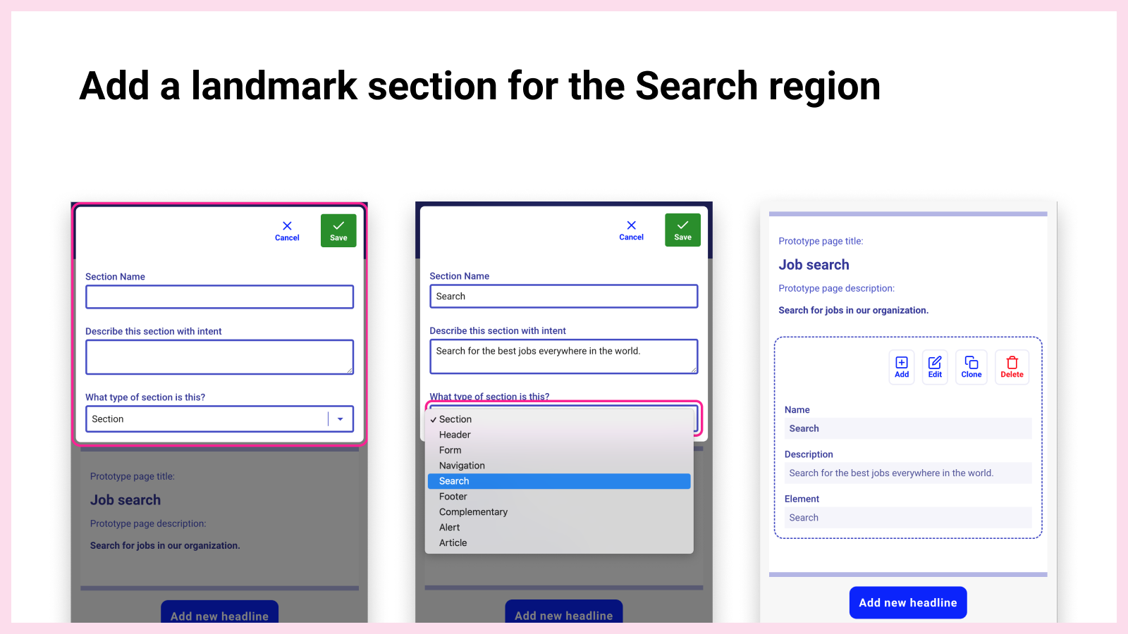
Keyboard-only users need different ways to navigate web pages. Adding properly named and described sections enable keyboard-only users to jump direct to a portion of the page.

3) Adding an input

Let’s add an input inside the search section
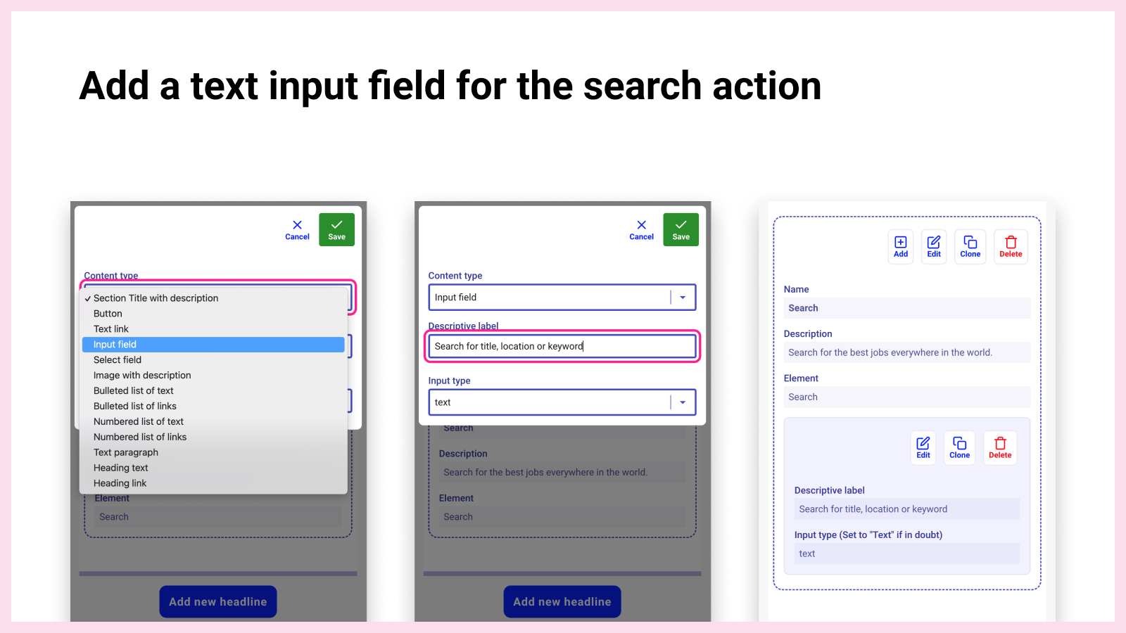
In the illustration above, the label describes the function of the input form control, and generally appears adjacent to it. Sighted users make the connection visually, but others cannot. Adding a well-described label will ensure screen readers announce the text label when the user navigates to the input.

4) Adding an action button

Following the text input, the user will need an action button to submit the search string.
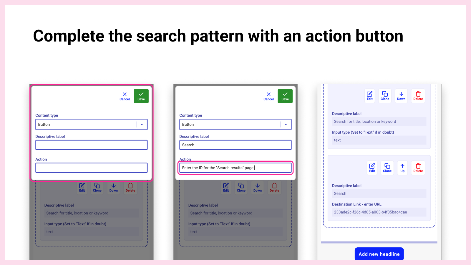
One last step for the search pattern is to add an action button to submit the search and direct the user to the 'Search Results' page.

5) Preview Accessible Prototype

Scroll to the top of the page and hit preview. A new tab window opens up with the elements just built.
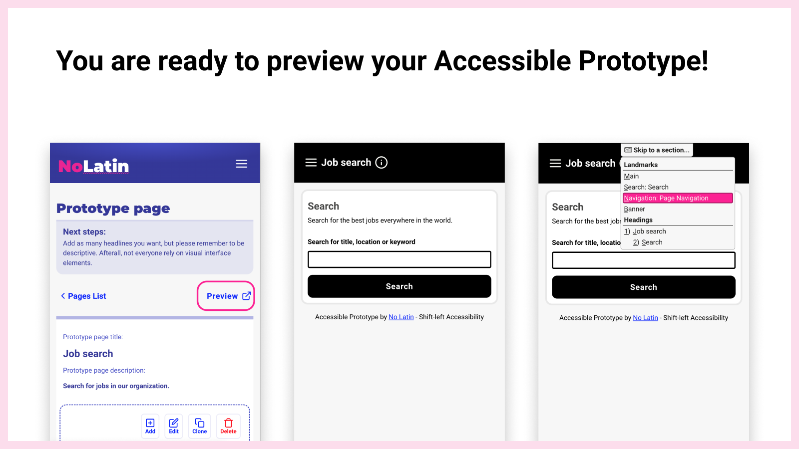
On the top od the Prototype Page, the 'Preview' button will create the Accessible Prototype with all the web accessibility best practices built in.

No Latin will generate a web prototype with all the Accessibility best-practices built-in:

  • Detailed skip-links
  • Purposeful landmarks
  • Semantic headings
  • Good ARIA attributes
  • Image alternative text
  • Visual focus appearance

I believe this method will enable UX professionals to be proactive about including people with disabilities early in the design process - this approach is known as “shift-left.”

Including people with disabilities in usability studies
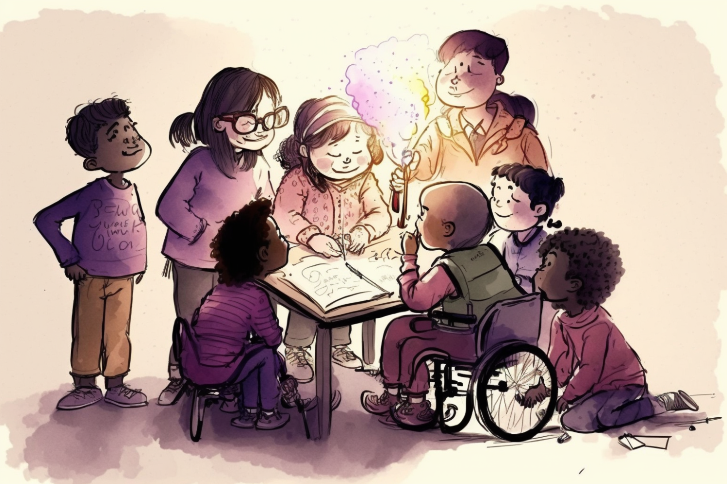
An illustration of a multicultural group of children, including a boy in a wheelchair, working through soving a problem together.

I also created a user testing guidelines on how to provide proper accomodations for assistive technology users during usability studies.

As UX professionals, you are committed to designing solutions as ambassadors for all users, including people with disabilities.

This tool invites all designers and researchers to bringing intent into their design process by elevating the content quality early for people with disabilities.

Conclusion

No Latin is a humble initiative to help UX professionals like me improving the user experience of people with disabilities.

I aim to motivate other UX professionals to write quality content early so they can produce accessible prototypes for usability studies that include all types of users.
Inclusive means All users

I'm a designer and developer with over 12 years of experience leading and contributing to Agile teams.

I craft enterprise-level and SaaS solutions for All users, regardless of race, ethnicity, age, gender, religion, sexual orientation, gender identity, gender expression, disability, economic status and other diverse backgrounds.

If you care inclusion and diversity, I'd love to learn about your company and see how I can help, feel free to send me a message!

Contact Marcelo Paiva
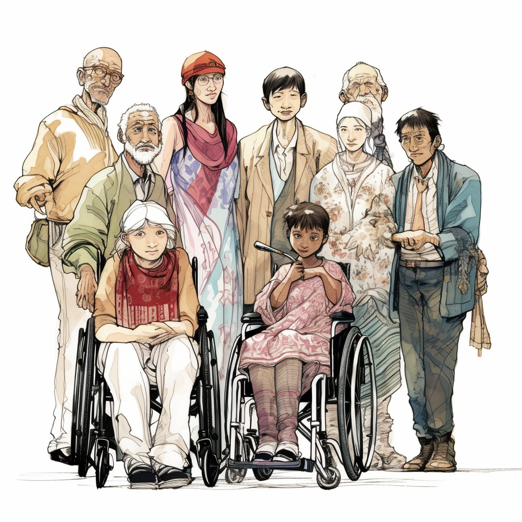
A generative art created using MidJourney, where it illustrates a diverse group of people using Yoshitaka Amano's painting style.
AI-generated art prompt: (3 of 5)
a group of people from different race, ethnicity, age, gender, religion, disability, economic status and other diverse backgrounds, on a white background, Yoshitaka Amano style. --v 5 --s 250