

Should a design portfolio be accessible?
As designers, our job is to create experiences that are inclusive and welcoming to everyone. Yet, how often do we think about accessibility when it comes to our own resumes and portfolios? In this article I'll share some accessibility and explain why making your resume and portfolio accessible is not just important, but essential.
Listen to this essay
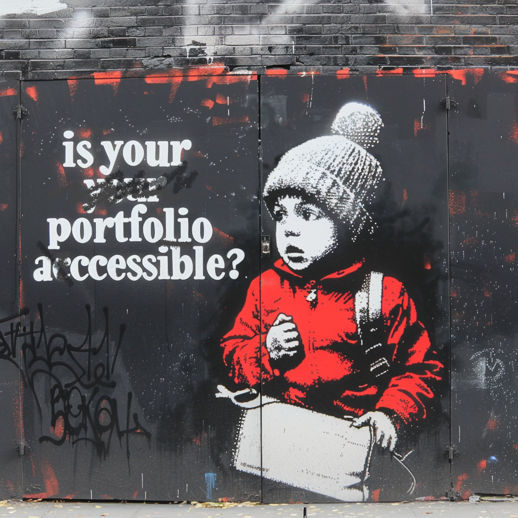
As designers, our job is to make experiences everyone can enjoy. But how often do we think about accessibility in our own resumes and portfolios?
Here's why we should, and how.
An accessible portfolio says something about you
It shows your values. Taking care with accessibility in your own work tells employers and clients that inclusion matters to you, and that you know why designing for everyone is important.
It shows your skills, too. An accessible portfolio doesn't only help disabled people; it's better for everyone.
Clear navigation, readable fonts and good color contrast make your work easier to enjoy and to find your way around. And it's a great way to show off what you can do.
It helps people find you, because accessible websites often rank better in search engines. Semantic HTML, a proper heading structure, alt text for images and a logical layout can all make you easier to find online.
And people stay longer. Recruiters and hiring managers who find your work easy to navigate and understand are more likely to spend time with your portfolio, and to get in touch.
Ten things to do
Use clear HTML. Clear HTML helps screen readers understand your content. Use
tags like <header>, <main>, <article> and <footer> to set out a logical
order. It helps accessibility, and it helps search engines too.
Example:
<header>
  <h1>Marcelo Paiva</h1>
  <nav>
    <ul>
      <li><a href="#about">About</a></li>
      <li><a href="#portfolio">Portfolio</a></li>
      <li><a href="#contact">Contact</a></li>
    </ul>
  </nav>
</header>
<main>
  <section id="about">
    <h2>About Me</h2>
    <p>I’m a UX designer, developer and passionate about accessibility...</p>
  </section>
  <section id="portfolio">
    <h2>My Work</h2>
    <!-- Portfolio items -->
  </section>
</main>
<footer>
  <p>© 2024 Marcelo Paiva</p>
</footer>
Make sure the color contrast is good. Text needs enough contrast against its background to be readable for people with low vision.
Use a tool like the WCAG Contrast Checker to check your colors meet the WCAG AA or AAA standards.
Use a contrast ratio of at least 4.5:1 for normal text, and 3:1 for large text.
Give every image alt text. Alt text lets screen readers describe images to people who can't see them. Be descriptive, but brief.
Example:
<img src="portrait.jpg" alt="Portrait of Marcelo Paiva, a UX designer passionate about accessibility">
Use fonts and sizes that are easy to read. Avoid very small text. Make sure your text can be resized without losing content or features.
Use a base font size of at least 16px, and avoid decorative fonts for long passages.
Make your navigation work with a keyboard. Every link, button and other interactive element should work from the keyboard alone, which is essential for people who can't use a mouse.
Use the :focus pseudo-class to highlight the focused element. And make sure
every form field and button can be reached with Tab, in a logical order.
Make your forms accessible. Label each field properly, give clear instructions, and make sure forms work with a keyboard. Use ARIA labels only where a visible label can't do the job.
Example:
<form>
  <label for="name">Name:</label>
  <input type="text" id="name" name="name">

  <label for="email">Email:</label>
  <input type="email" id="email" name="email">

  <button type="submit">Submit</button>
</form>
Test with a screen reader. Test your portfolio regularly with a free screen reader, like NVDA (opens in a new tab) on Windows or VoiceOver on a Mac. It finds problems you won't notice otherwise.
Use the screen reader to move through your site, and make sure everything can be reached and understood. Deque's Screen Readers Survival Guide has the Basic Keyboard Shortcuts (opens in a new tab) to get you started.
Mark the page's regions. Landmarks help screen reader users understand how
your page is organized, and jump straight to the part they want. The HTML
elements are the landmarks: <header>, <nav>, <main> and <footer>.
Example:
<header>
  <!-- Site header -->
</header>
<nav>
  <!-- Site navigation -->
</nav>
<main>
  <!-- Main content -->
</main>
<footer>
  <!-- Footer information -->
</footer>
Reach for a role attribute only when a region has no element of its own. An
element that already means something needs no ARIA to say it again.
Offer more than one way to reach you. Give people several contact methods, such as email, phone and social media, to suit different preferences and needs.
Put a contact form, an email address and social media links on your contact page.
Choose an accessible template. On platforms like Squarespace, be careful which template you pick. Not all of them were built with accessibility in mind.
Look for templates with proper heading structure, high contrast and keyboard navigation. Avoid ones that lean on images without alt text, or have poor contrast.
Check a template's accessibility before you commit to it, and fix what you need to.
Test with WAVE. The WAVE tool (opens in a new tab) checks your site for accessibility problems. It's free, and it shows you visually where the problems are. Run it regularly, to catch new ones.
Your portfolio is your first design review
Making your portfolio accessible means more people can appreciate your work. Follow these tips, and you show your commitment to inclusive design, and stand out as a thoughtful, professional designer.
If you'd like help with this, I volunteer a couple of hours a week to help UX professionals.
That covers the end-to-end design process, digital accessibility, getting into the industry, portfolio reviews and resume advice.
Schedule a 1:1 session (FREE) (opens in a new tab), and let's review your portfolio.
Make your work accessible to everyone, because it's the right thing to do.
Hell yeah!
About the drawing
The drawing for this piece was generated, not chosen. Hashing the piece’s name fixes one point on the color wheel; the other two follow from it. The same name always gives the same three colors.
#8d497d#459e6f#c1706eThe line under the drawing marked “Meant to show” is written by a person, not the model. A generated drawing keeps what is large and loses what is small, so the detail that decides who someone is can go missing, and a picture only reaches people who can see it. Where the drawing and that line disagree, the line is the intent.
Or press ←the left arrow and →the right arrow.