What do neurodivergent users need from our designs?
Just like how everyone sees and appreciates art in their own way, the way we interact with digital spaces can also be unique. This is especially true for those who are neurodivergent, and as UX designers, we need to keep these differences in mind. This article will guide you through some essential tips for designing with neurodivergent users in mind.
Listen to this essay
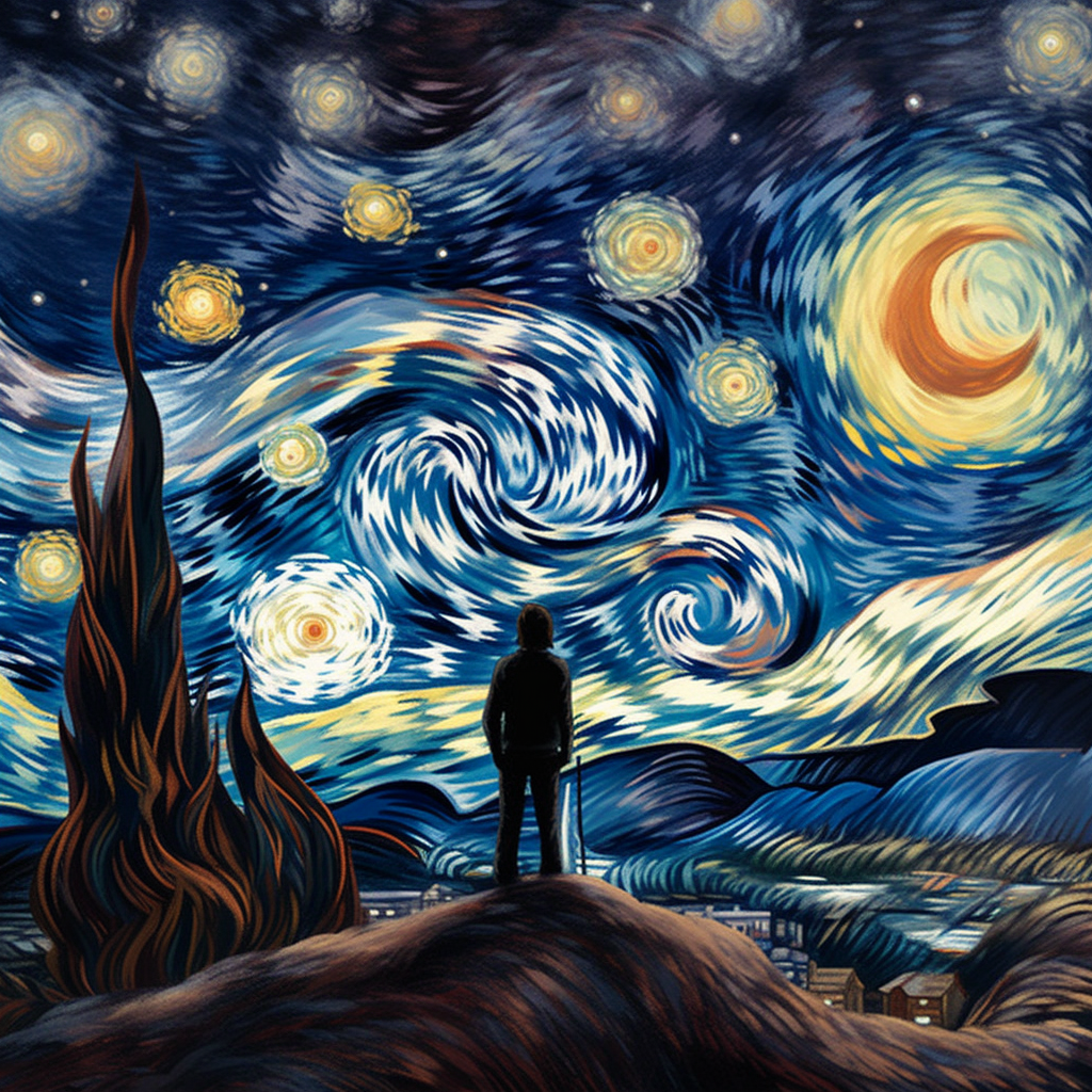
Think of Van Gogh's Starry Night, and the swirl of stars you can get lost in.
Now imagine taking in that painting differently, because your brain handles things differently from most people's. That's what it can be like to be neurodivergent.
And as designers, we need to keep those differences in mind. The good news is that most of what helps is simple.
Music opened a door for Ryan
Our brains adapt in remarkable ways. Watch this video of Ryan Woodard, a young autistic man, singing a song by John Mayer.
Ryan was considered nonverbal until he was about nine. "Because of my autism, I struggle with words," he told Santa Rosa Junior College (opens in a new tab). Music helped his brain find a way through, and in the end, it helped him learn to speak.
Music opened up a new world for Ryan. Good design, and accessible design above all, can help people like him feel welcome, and settle into a new digital place.
Neurodivergent describes a way of thinking
When we say someone is "neurodivergent," we mean their brain works differently from what's often considered "normal."
It isn't a medical term, and being neurodivergent doesn't mean a person has a disability or a disorder. It's a word for different ways of learning and taking in information.
The other side is "neurotypical." It describes a person whose brain works and takes in information in the way most people expect.
Six things help
Designing with neurodivergent users in mind doesn't have to be complicated. Here's what to pay attention to.
Say things clearly, and the same way every time. Keep it simple. Use plain, direct language, and avoid sayings or expressions that might not be clear to everyone. Give clear instructions. Don't rely on hints or cues alone.
Clear the clutter. A busy, messy interface is nobody's friend, so keep things tidy and easy to follow. Avoid too many things to look at or listen to at once, because they can overwhelm some users.
Let people adjust it. Everyone's different, and what works for one person may not work for another. Let users change the colors, font sizes, contrast and other parts of the interface until it's right for them.
And stay away from "overlays", scripts that try to fix accessibility on the fly. They can create new barriers for other people.
Tell people how they're doing. Let them know when they've finished something. That can be as simple as a pop-up message, a sound, a progress bar or a checklist.
Mind the senses. Be careful with bright lights, loud sounds or particular animations, because some people find them overwhelming or uncomfortable. Give users a way to control, mute or adjust them.
Test with a wide range of people. The best way to find out whether a design works is to test it with many different users, neurodivergent people included.
Ask for feedback, and bring all kinds of people into the design process.
And if you're hiring, think about bringing disabled people onto your team.
It's about people
Accessibility isn't about checkboxes and legal requirements. It's about people. It's about everyone having equal access to information, services and opportunities, however their brain is wired.
Ryan found his voice through music. As designers, we have the power to make digital places that open new doors for neurodivergent people.
If we pay attention to what we design, we can build bridges and take down barriers, so everyone can find their way through our digital world more easily.
Let's keep learning, adapting and growing together, toward a more inclusive and accessible world.
About the drawing
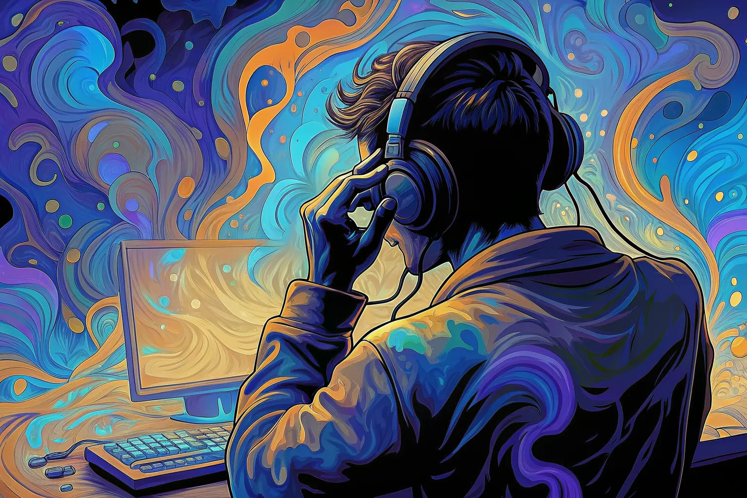
The drawing for this piece was generated, not chosen. Hashing the piece’s name fixes one point on the color wheel; the other two follow from it. The same name always gives the same three colors.
#357588#3d52d7#c67a4eThe line under the drawing marked “Meant to show” is written by a person, not the model. A generated drawing keeps what is large and loses what is small, so the detail that decides who someone is can go missing, and a picture only reaches people who can see it. Where the drawing and that line disagree, the line is the intent.
Or press ←the left arrow and →the right arrow.